Blog · 12 min read
Alt Text Guidelines for Creators and Developers: What to Write and Why

Good alt text is short, specific, and answers one question: why is this image here? If it’s decorative, use alt="" and let it disappear for screen reader users. If it’s functional, describe the action, not the artwork. If it’s a photo carrying real meaning, describe that meaning in a sentence or two and skip phrases like “image of.” These rules trace directly back to the W3C’s Web Accessibility Initiative and Section 508 guidance, and they cover the images most sites use day to day.
TL;DR:
Alt text should be concise, ideally around 150 characters, emphasizing important words and avoiding redundancy or unnecessary framing.
For functional icons or buttons, describe the action or destination rather than visual appearance, and write alt text in the same language as the page.
Complex images like charts or diagrams require a short descriptive alt and a detailed, visible explanation elsewhere on the page, often in a data table or caption.
Decorative images must have an
alt=""attribute without spaces so screen readers skip them; meaningful images need descriptive, context-aware text.Regular site audits with automated tools and human reviews are essential to catch missing or incorrect alt text, especially on high-traffic or task-critical pages.
Table of Contents
Why Alt Text Guidelines Exist in the First Place
Alt text isn’t a checkbox you tick and forget. It’s the only thing standing between a screen reader user and the information sighted visitors get for free. When a screen reader hits an image with no alt attribute, it often reads the filename aloud instead, something like “IMG underscore 4471 dot jay peg.” That’s the experience you’re preventing.
Alt text also acts as fallback content. If an image fails to load because of a slow connection, a broken link, or a corporate firewall blocking a CDN, the alt text renders in its place. This matters more than most developers assume, especially for e-commerce sites where product images can fail to load on slow mobile connections.
Three groups benefit directly:
-
Screen reader users, who rely on alt text as their only description of visual content.
-
Low-bandwidth or unreliable-connection users, who see alt text when images don’t load.
-
Search engines, which use alt text to understand image content, and voice assistants that read pages aloud.
The technical backbone here is WCAG’s Success Criterion 1.1.1, which requires text alternatives for non-text content. That single criterion is why “alt text guidelines” shows up in accessibility audits from Section 508 reviews to EN 301 549 conformance checks. Skip it, and you’ve failed one of the most commonly cited accessibility criteria on the web.
Alt Text Best Practices Every Creator Should Follow
Most alt text problems come down to five habits: writing too much, writing too little, describing the wrong thing, formatting it wrong, or forgetting it needs to match the page it lives on.
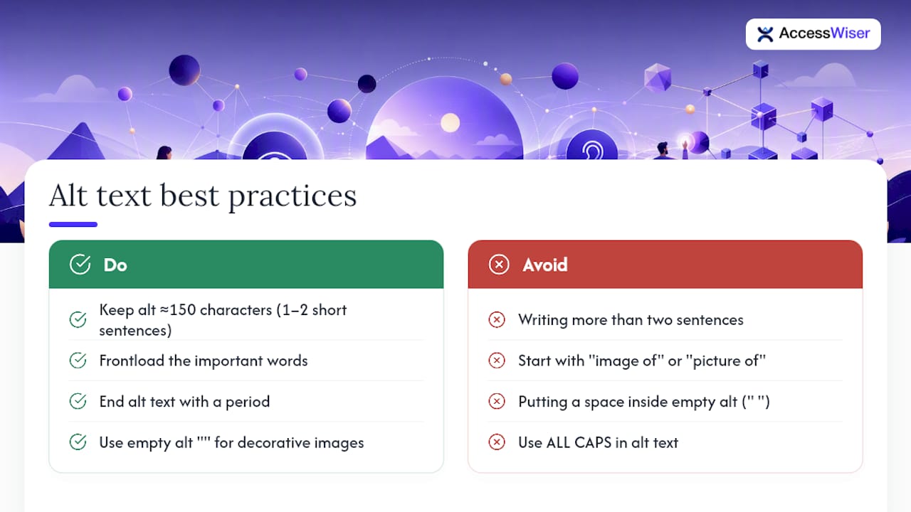
Length matters more than you’d think. NN/g recommends keeping alt text around 150 characters or 1 to 2 short sentences, because screen readers generally don’t let users pause mid-description. Whatever you write gets read start to finish, so long alt text becomes a memory burden rather than a helpful cue. Frontload the important words. “Golden retriever puppy chewing a leather boot” beats “A photo showing what appears to be a puppy, specifically a golden retriever, in the act of chewing on what looks like a leather boot.”
Cut the redundant framing. Screen readers already announce that an element is an image before reading the alt text. Starting with “image of” or “picture of” wastes characters and adds nothing. Write “Red high-top sneaker, side view” instead of “This is an image of a red high-top sneaker shown from the side.”
Punctuation isn’t optional. End your alt text with a period. Doing so creates a brief pause in most screen readers, which keeps your description from running audibly into the next piece of content on the page. It’s a small detail that makes a real difference in how natural the listening experience feels.
Watch the empty alt attribute. When marking an image decorative, use alt="" with absolutely no space between the quotation marks. A stray space, alt=" ", can trick some screen readers into announcing the image anyway, defeating the entire purpose of marking it decorative in the first place.
Match the page language. Alt text should be written in the same language as the surrounding content, which is the language declared in the page’s lang attribute. A page with shouldn’t carry leftover French or Spanish alt text just because the image came from a foreign-language site. If alt text genuinely needs to be in another language, add a lang attribute to that img element so screen readers switch pronunciation (WCAG 3.1.2, Language of Parts). This is easy to miss when content gets translated piecemeal.
Stay consistent across repeats. If the same product photo appears in a gallery and again in a “related items” carousel, use the same alt text both times unless the context genuinely changes what matters about the image. Inconsistent descriptions of the same image confuse users navigating by image list, a common screen reader shortcut.
Avoid all caps in alt text. Screen readers sometimes read capitalized words letter by letter, turning “SALE” into “S. A. L. E.” That’s not the emphasis you were going for.
Pro Tip: If your alt text is running past two sentences, that’s usually a sign the information belongs in visible page text instead. Move the detail out of the alt attribute and into a caption, and let the alt text just point to it.
Writing Alt Text for Different Image Types
Not every image needs the same treatment. The right approach depends entirely on what job the image is doing on the page.
-
Informative photos and portraits. Focus on the image’s role in context, not an exhaustive visual inventory. A headshot on a “Meet the Team” page needs a name and title, like “Maria Chen, Head of Product,” not a rundown of hair color and clothing. Include identity details only when they serve the page’s purpose. A stock photo used purely for visual atmosphere on a blog post header often qualifies as decorative and should carry
alt="". -
Logos. Logos are not decorative, even though they appear on nearly every page of a site. Include the exact company or brand name, such as “AccessWiser logo,” unless the logo functions as a link to the homepage, in which case the alt text should reflect that action, like “AccessWiser home.” W3C guidance treats images of text as needing the same words present in the image, and a logo is functionally a small image of text.
-
Icons and functional images. This is where a lot of teams get it backward. A magnifying glass icon that triggers a search field shouldn’t be described as “magnifying glass icon.” It should say “Search.” WebAIM’s guidance on functional images is blunt about this: describe the destination or action, never the visual appearance. A trash can icon that deletes a row should read “Delete item,” not “Trash can.”
-
Buttons and download links. Same logic applies. An icon-only download button needs alt text like “Download 2026 annual report PDF,” giving the user enough to decide whether to click without needing sight to interpret an icon.
-
Background images and spacers. These almost always belong in CSS, not in an
<img>tag, which sidesteps the alt text question entirely. If a background image must live in HTML for legacy reasons, mark it decorative withalt="". -
Duplication with surrounding text. If a caption or paragraph already states everything the image conveys, the image itself becomes decorative in that context, even if the same file carries meaningful alt text elsewhere on the site. Context determines the right alt text for a given placement, not the file itself. A product thumbnail might need a description in one place and alt=“” in another, such as a card where the image sits inside the same link as the product name, so the name would otherwise be announced twice.
Handling Charts, Diagrams, and Other Complex Images
Complex images, charts, infographics, and diagrams need a different structure entirely: a short alt attribute that states what the image is and its main takeaway, paired with the full detail somewhere visible on the page.
Trying to cram a bar chart’s full dataset into one alt attribute is a losing move. Screen reader users get a wall of numbers with no way to pause, skip around, or compare values, which defeats the purpose of a chart in the first place. The better path, described in the W3C’s complex images tutorial, is a two-layer approach:
-
Write a concise alt text stating the chart type and the headline finding, such as “Bar chart: mobile traffic grew from 34% to 61% between 2022 and 2026.”
-
Place the full dataset in a visible HTML table directly below or beside the image, or link to a longer description if the data is extensive.
-
Use
<figure>and<figcaption>to pair an image with a written summary, giving both sighted and non-sighted users a consistent anchor point. -
For diagrams showing relationships or sequences (flowcharts, org charts), expose that structure in an ordered list or table rather than trying to encode hierarchy inside a sentence.
| Image type | Alt text approach | Where the detail lives |
|---|---|---|
| Simple bar or line chart | Short alt with type and main trend | Visible data table nearby |
| Infographic with multiple stats | Alt states topic and key figure | Full text version below or linked |
| Flowchart or process diagram | Alt names the process and outcome | Ordered list or table showing steps |
| Org chart | Alt states the top-level structure | Nested list reflecting hierarchy |
This isn’t just an accessibility fix. Putting complex data into visible HTML instead of long alt text can help SEO too, since search engines can read a visible table more usefully than a 400-character alt attribute.
Alt Text Examples You Can Copy Right Now
-
Decorative divider image:
alt="". This is appropriate because the graphic adds no information, only visual spacing between sections. -
Photo carrying real meaning: “Warehouse worker scanning inventory barcode with handheld device.” This works because it names the subject and action instead of generic filler.
-
Logo in the header: “AccessWiser home.” This fits because the logo also functions as a homepage link, so the alt text reflects that action.
-
Icon-only download button: “Download the 2026 accessibility report PDF.” This works because it tells the user exactly what clicking does.
-
Pie chart summary: “Pie chart: 58% of site visits came from mobile devices in Q3. Full breakdown below.” This succeeds because it frontloads the key figure and points to the detailed table.
Building Alt Text Checks Into Your QA Workflow
Automated scanners catch missing alt attributes at scale, but they generally can’t judge whether the wording actually matches the author’s intent. Pair automated coverage checks with a human reviewer who confirms context.
-
Test with at least one screen reader (NVDA or VoiceOver are common choices) before publishing.
-
Confirm decorative images are silently skipped and functional buttons announce their action clearly.
-
Add alt text review to CMS templates, pull request checklists, and accessibility changelogs so it isn’t an afterthought.
Pro Tip: Bake an alt text field into your CMS as a required input for content images, and leave it optional only for elements you’ve pre-flagged as decorative.
What We Prioritize When Scaling Alt Text Fixes
Teams should fix alt text on high-traffic, task-critical pages first: checkout flows, navigation icons, primary product photos. Everything else follows. We also push for documentation and scheduled re-checks, because alt text regresses fast when new content ships without a template enforcing it.
The AccessWiser Team
Let AccessWiser Catch What Manual Reviews Miss
Writing good alt text is only half the job. Knowing which images across a 500-page site are missing it, mislabeled, or broken after your last CMS update is the other half, and it’s the part manual review rarely keeps up with. AccessWiser scans your site against WCAG 2.2 AA criteria, with Section 508 and EN 301 549 mappings, and ties every finding to the exact element and success criterion it affects, so your developers fix the code itself rather than patching around it at runtime.
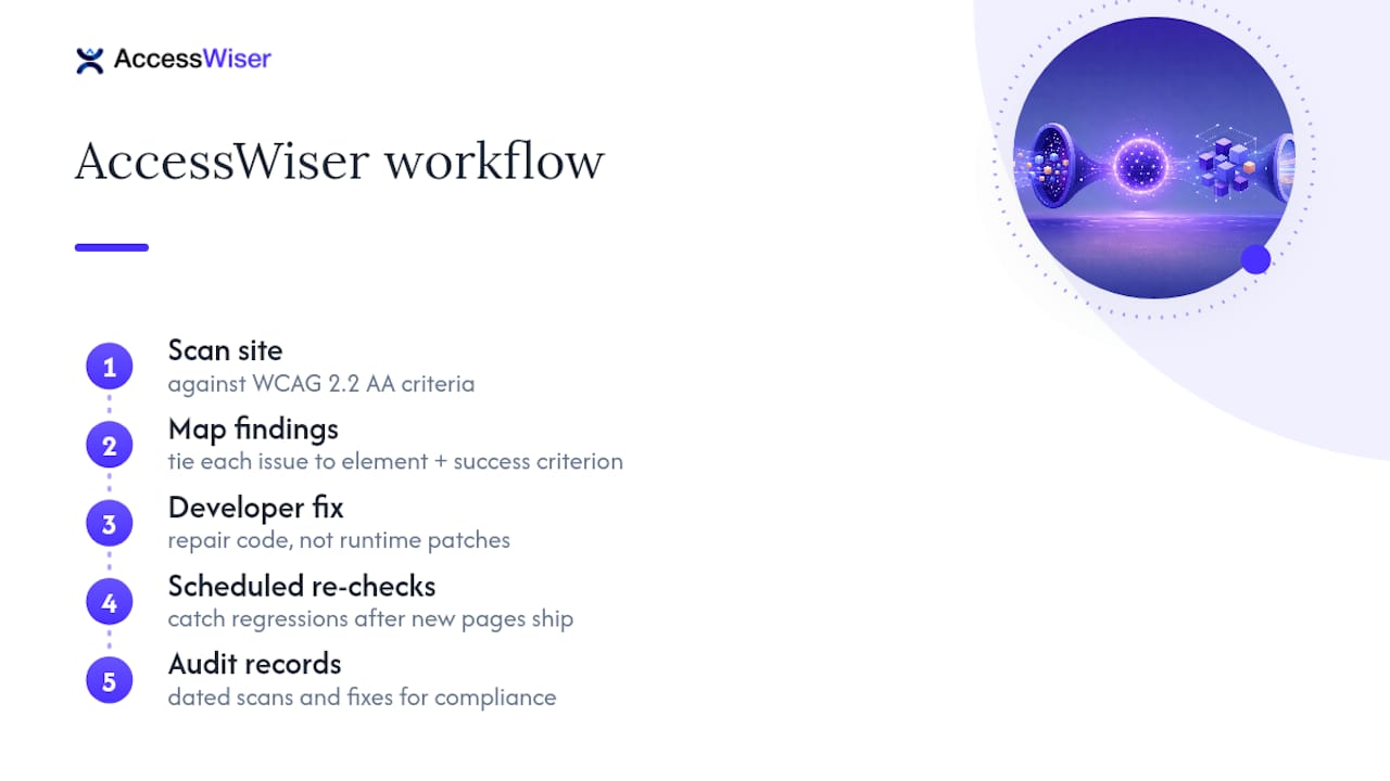
Scheduled re-checks help flag regressions when a new page ships without proper alt attributes, and dated records of scans and fixes give you a documented history of your accessibility work. If you’re managing alt text across dozens or hundreds of pages, explore AccessWiser’s accessibility solutions and start a trial to see where your current gaps actually are.
Sources
FAQ
How Long Should Alt Text Be?
Aim for roughly 150 characters or one to two short sentences, frontloading the most important words since screen readers read the full text without pausing.
Do I Need Alt Text on Every Image?
Every non-decorative image needs a meaningful alt attribute, and decorative images still need an alt="" attribute so screen readers skip them cleanly instead of reading the filename.
What’s the Difference Between Alt Text and a Caption?
Alt text serves screen readers and describes the image’s purpose for accessibility, while a caption is visible text meant for all readers and can carry more detail or context.
Can AccessWiser Help Fix Missing Alt Text Across My Whole Site?
Yes. AccessWiser scans for WCAG 2.2 AA issues, including missing or empty alt attributes and alt text that looks like a filename, links each finding to its specific element, and provides plain-language guidance your developers can apply directly in the code. Whether the wording fits the image still needs a human reviewer.
Should Alt Text Match the Page’s Language Attribute?
Yes. Alt text should be written in the language declared in the page’s lang attribute. If it has to be in a different language, add a lang attribute to the image so screen readers pronounce it correctly.
Articles on this blog are general information about web accessibility, not legal advice. Laws change and their application depends on your specific situation — for decisions with legal consequences, consult a qualified legal professional.
Articles on this blog are general information about web accessibility, not legal advice. Laws change and their application depends on your specific situation — for decisions with legal consequences, consult a qualified legal professional.