Blog · 13 min read
6 CI Tests for Carousel Accessibility: WCAG 2.2 for Developers
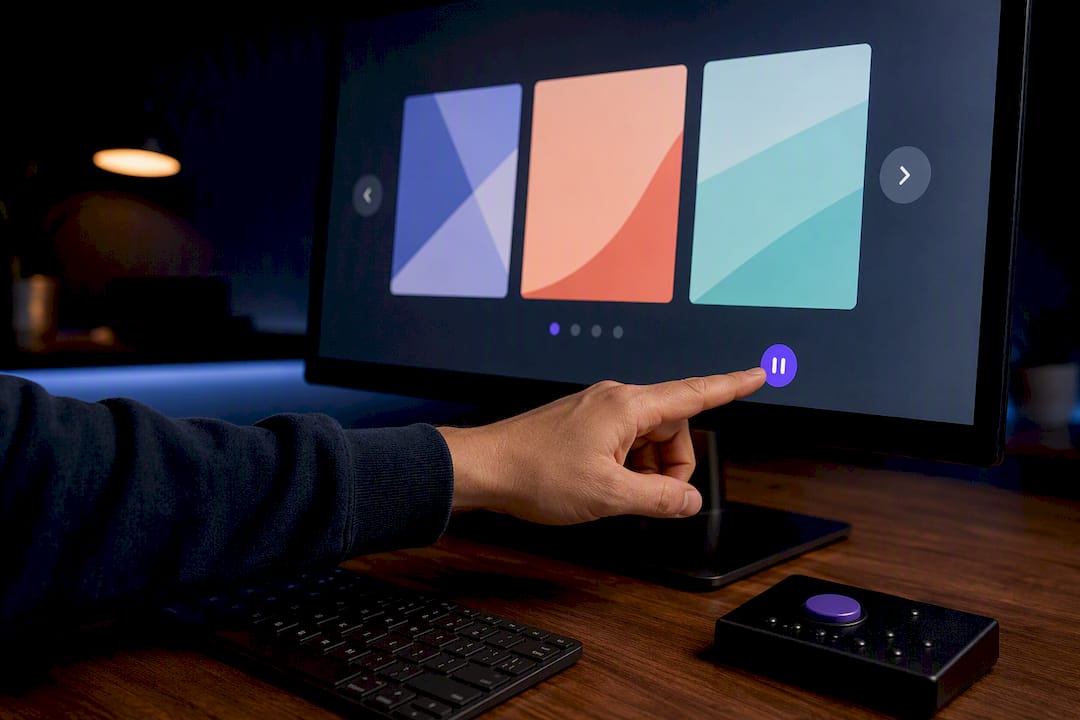
An accessible carousel must give users control, stay fully keyboard operable, announce slide changes sensibly, and never steal focus without permission. That’s the whole rule set at its core. Anything auto-starting that runs longer than a short duration needs a way to pause, stop, or hide it, and if you’re not sure whether to enable autoplay, default it to paused.
TL;DR:
- Carousels must have pause, stop, or hide controls to comply with accessibility standards, especially for auto-rotating content exceeding five seconds.
- Controls should be native, keyboard-operable buttons placed before slides in DOM order to ensure predictable focus navigation.
- Use
aria-live="polite"only for manual slide changes, avoiding live region announcements during auto-rotation to prevent screen reader disruption.- Auto-advancing slides must never steal focus, and pause controls should be visible, with states clearly indicated to all users.
- For dynamic updates, recalculate slide counts and handle focus carefully when adding or removing slides to maintain a consistent, accessible experience.
Table of Contents
- What Carousels Are and When to Avoid Them
- Why Accessibility Matters for Carousels
- Core Accessibility Requirements for Carousels
- Authoring Patterns and ARIA Roles for Carousels
- Keyboard and Focus Management Best Practices
- Autoplay, Controls, and Reduced Motion
- Implementation Checklist and Code Pointers
- How to Test a Carousel for Accessibility
- Handling Dynamic Content Updates in Carousels
- Accessible Gesture and Touch Support on Mobile
- Managing Timing and Animation for Cognitive Accessibility
- Our Take: Why Pausing by Default Isn’t a Compromise
- How AccessWiser Helps You Fix Carousel Issues for Good
- Sources
- FAQ
What Carousels Are and When to Avoid Them
A carousel (also called a slider or slideshow) rotates through a set of content panels, usually images, promos, or featured items, inside one fixed space. Sites lean on them for hero banners, product galleries, and homepage promotions because they let one region hold five messages instead of one.
That efficiency comes at a cost. Most visitors interact with slide one and never touch the rest, which means content buried in slide three or four might as well not exist. Before building a carousel, weigh it against simpler patterns:
- A static grid or list shows everything at once with no discovery problem.
- Tabs let users jump directly to the content they want without waiting through a rotation.
- A single strong hero image often communicates as much as five weak ones.
If your content genuinely benefits from sequencing, and would lose meaning if crammed into a grid, a carousel earns its place. Otherwise, skip it.
Why Accessibility Matters for Carousels
Auto-rotation is the root of most carousel accessibility failures. A screen reader user reading slide two loses their place when the carousel jumps to slide three mid-sentence. A keyboard user tabbing toward a control can find the DOM has shifted underneath them. Someone with vestibular sensitivity may find continuous motion genuinely uncomfortable, not just distracting.
WebAIM’s carousel research is blunt about this: auto-rotating content disorients screen reader users badly enough that disabling rotation, or avoiding carousels altogether, is often the safer call. WCAG 2.2 backs this with an enforceable rule, not just a recommendation. These aren’t edge cases affecting a handful of visitors. They’re everyday interactions for anyone navigating by keyboard, screen reader, or reduced-motion setting, and a broken carousel can block them from reaching the content or checkout flow behind it.
Core Accessibility Requirements for Carousels
Four requirements separate a compliant carousel from a lawsuit waiting to happen.
- Pause, stop, or hide. WCAG 2.2 Success Criterion 2.2.2 requires a mechanism to pause, stop, or hide any auto-starting movement lasting more than five seconds. This isn’t optional guidance. It’s a testable pass/fail criterion.
- Native, keyboard-operable controls. Build Previous, Next, and Play/Pause as real
<button>elements, not styled<div>s with click handlers. Buttons come with keyboard focus, Enter/Space activation, and correct semantics for free. - Sensible announcements. Use
aria-live="polite"on the slide region only when a user manually changes slides. Turn it off during autoplay, or a screen reader will interrupt itself every few seconds with a new announcement nobody asked for. - No focus theft. Auto-advancing to the next slide must never move keyboard focus. If a user is reading or tabbing through slide one, an autoplay tick should not yank their cursor to slide two.
Pro Tip: Run a quick timer test on your own carousel. If it advances before you finish reading the first slide’s text out loud, your timing is already failing real users, regardless of what a scanner says.
Authoring Patterns and ARIA Roles for Carousels
The WAI-ARIA Authoring Practices Guide (APG) documents three carousel patterns, and picking the right one matters more than most teams realize.
The basic pattern uses role="region" with aria-roledescription="carousel" around the whole component and role="group" on each slide, labeled with something like “Slide 3 of 6.” It suits simple image rotators with Previous/Next controls.
The tabbed pattern swaps slide-jumping dots for a proper tablist/tabpanel structure, which gives screen reader users explicit context about how many slides exist and which one is active. Use aria-selected on the active tab and aria-disabled (never the plain disabled attribute) on indicators, so they stay in the tab sequence for context.
The grouped pattern treats each slide as its own labeled region, useful when slides contain rich, independent content rather than a single image.
Whichever pattern you choose, put controls before the slides in DOM order. That keeps tab order predictable: a keyboard user hits the rotation control and navigation buttons before wading into slide content.
Keyboard and Focus Management Best Practices
Get the tab order right and most other keyboard problems solve themselves. The APG’s own examples put the rotation control first, then Previous/Next, then slide indicators, then slide content itself. That sequence matches how a sighted user scans the component visually, top-left to bottom-right.
Arrow keys are a convenience layer, not a replacement for Tab. Wire Left/Right arrow support once basic Tab navigation works, and never make arrow keys the only way to move between slides.
- Keep focus on the button a user just activated. Clicking “Next” should not silently push focus into the new slide’s content.
- Auto-advance should never touch focus at all, per the APG carousel pattern.
- Every control needs a visible focus outline that survives whatever image sits behind it. Smashing Magazine’s guide recommends placing controls outside the image boundary specifically to dodge contrast collisions.
- Touch targets should measure at least 24 by 24 CSS pixels, per WCAG guidance on target size.
Autoplay, Controls, and Reduced Motion
Default autoplay to off when you can. It’s the single change that prevents the most complaints, and it costs nothing in development time. Defaulting to paused on page load measurably improves the experience for people with visual or cognitive disabilities and for anyone who simply prefers to control their own screen.
If autoplay exists, the Play/Pause button needs to stay visible and first in tab order at all times, not hidden until hover. Its accessible name has to change with its state: “Stop Automatic Slide Show” when playing, “Start Automatic Slide Show” when paused. A generic “Pause” label that never updates leaves screen reader users guessing.
Rotation must stop the instant a mouse hovers over the carousel or keyboard focus lands inside it, and it should only resume when the user explicitly restarts it. Never auto-resume after a timeout. Finally, check prefers-reduced-motion and disable transitions or autoplay entirely for anyone who has that operating system setting turned on.
Implementation Checklist and Code Pointers
Run through this before shipping any carousel:
- Slide region wrapped in
role="region"witharia-roledescription="carousel"and a real label. - Previous/Next/Play/Pause built as native
<button>elements, placed before slides in DOM order. aria-live="off"during autoplay, switched to"polite"only on manual navigation, per the APG’s tabbed carousel example.- Focus never moves on auto-advance; rotation halts on hover or focus entry.
- Reduced-motion media query checked and respected.
- Slide indicators use
aria-disabled, notdisabled, to stay in the tab sequence.
Avoid hiding off-screen slides with a naive
display: nonetoggle. It can wipe elements from the accessibility tree at the wrong moment, confusing assistive tech mid-interaction rather than cleanly removing inactive content.
That warning comes straight from WebAIM’s carousel techniques, and it’s one of the most common mistakes in otherwise well-built components.
How to Test a Carousel for Accessibility
Automated scanners catch a meaningful slice of carousel problems, but they consistently miss focus-stability issues, live-region timing, and contrast shifts across slide backgrounds. Pair automation with manual checks:
- Unplug the mouse and tab through the entire component, controls and slides both.
- Run NVDA or VoiceOver and confirm slide changes announce once, not in a loop.
- Toggle
prefers-reduced-motionat the OS level and confirm autoplay actually stops. - Measure control target sizes against the 24 by 24 CSS pixel minimum.
- Log the date, what you tested, and what you fixed. Good bug report documentation turns a one-time fix into evidence you can show an auditor later.
Handling Dynamic Content Updates in Carousels
Carousels that add or remove slides on the fly, product carousels pulling live inventory, personalized recommendation strips, infinite-scroll galleries, introduce a second layer of accessibility risk on top of the static baseline.
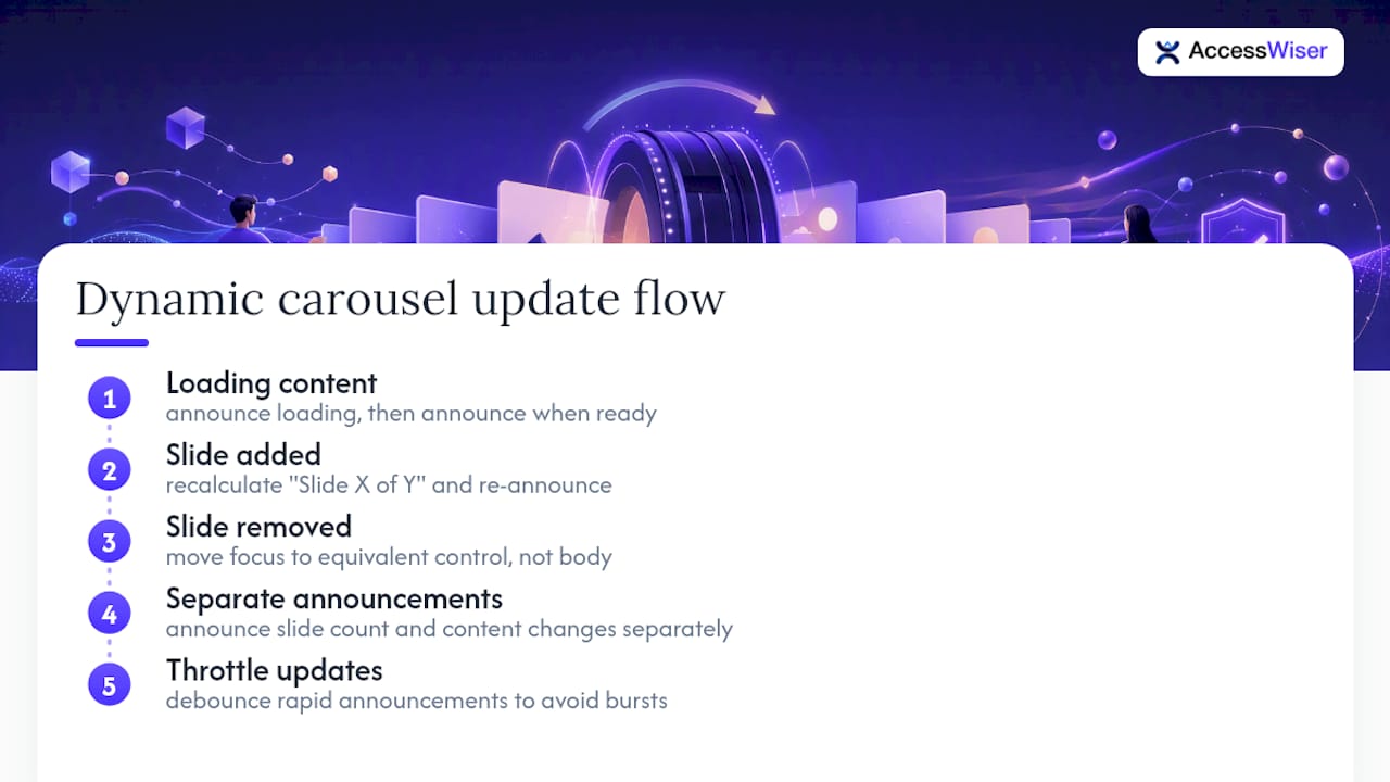
When a slide gets added after page load, update the total count in your labeling immediately. A slide labeled “Slide 3 of 6” that’s actually now one of eight slides gives screen reader users false information about their position. Recalculate and re-announce that count whenever the slide array changes, not just at page load.
Removing a slide is trickier. If a user has focus on a control tied to a slide that just disappeared, that focus needs somewhere predictable to land, typically the next available slide’s equivalent control, never a dropped focus that falls back to the document body. Test this specifically: remove a slide programmatically while a screen reader user is mid-navigation and confirm the experience doesn’t break.
Keep any live-region announcement about content changes separate from your slide-change announcement. Bundling “slide 4 of 7” with “3 new items added” in one aria-live update creates a run-on announcement that’s hard to parse by ear. Fire them as distinct, brief messages, and throttle rapid-fire updates so a fast-loading carousel doesn’t fire five announcements in two seconds. If slides load asynchronously, don’t render an empty slide region and then populate it silently. Announce that content is loading, then announce when it’s ready.
Accessible Gesture and Touch Support on Mobile
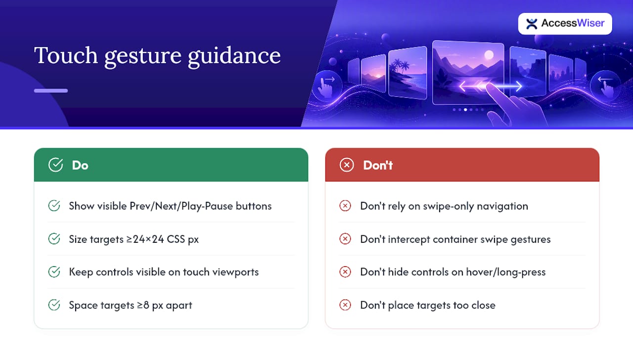
Swipe gestures feel natural on a touchscreen, but a carousel that relies on swipe as the only navigation method locks out anyone using a switch device, a screen reader’s gesture set, or a keyboard-emulating input on a tablet. Every swipe interaction needs a visible, tappable button equivalent, Previous, Next, and Play/Pause, sized to at least 24 by 24 CSS pixels so they’re usable without precision aiming.
Mobile screen readers like VoiceOver on iOS and TalkBack on Android already use their own swipe gestures to move between elements on a page. If your carousel intercepts swipe events at the container level, it can conflict directly with those built-in navigation gestures, effectively trapping a screen reader user inside the component. Test with VoiceOver or TalkBack running, not just with your thumb on an unassisted screen.
Avoid designing controls that only appear on hover or long-press. Touch devices don’t have a reliable hover state, and a control that’s invisible until a gesture reveals it is a control that doesn’t exist for a lot of people. Keep Previous, Next, and Play/Pause visible by default on touch viewports.
Spacing matters as much as size. Two tap targets sitting closer than roughly 8 pixels apart invite accidental taps, especially for anyone with a motor impairment or simply a large thumb. Give indicator dots and navigation arrows enough breathing room that a miss doesn’t trigger the wrong action.
Managing Timing and Animation for Cognitive Accessibility
Speed and motion are cognitive load, not just visual flourish. Someone with a cognitive or attention-related disability may need significantly longer than five seconds to read and process a slide’s content before it changes, and a fixed short timer effectively cuts their reading time off mid-sentence.
Rather than picking one universal duration, consider giving users a way to adjust the interval, or simply defaulting to a longer duration than feels necessary to a sighted, non-disabled developer testing at speed. A duration that feels slightly slow in your own testing is usually closer to right for real users. Pairing a generous default with a persistent Pause control, so anyone can simply stop the clock entirely, covers the range of needs better than any single timing value.
Animation style matters independently of speed. Cross-fades tend to read more calmly than hard slides or zoom effects, which can trigger discomfort for people with vestibular disorders even at a moderate pace. Honoring the operating system’s prefers-reduced-motion setting should disable transition animation outright, not just slow it down, since a slowed motion effect can still be a triggering one.
Never combine fast timing with no pause control. That pairing is the single worst combination for cognitive accessibility, since it gives a user no way to opt out of a pace that was never built with them in mind.
Our Take: Why Pausing by Default Isn’t a Compromise
Most teams treat “pause by default” as a concession, something you do reluctantly to satisfy an auditor. We see it differently. A carousel that starts paused and waits for a user to drive it isn’t a weaker product. It’s a more honest one, because it stops assuming every visitor wants the same pace, the same motion tolerance, and the same reading speed.
The bigger issue we keep seeing isn’t bad intentions. It’s that automated fixes alone don’t hold. A widget can patch a symptom at runtime, but the underlying markup keeps the same focus-management bug it always had, and it resurfaces the moment the widget is removed or misconfigured. Permanent fixes live in the code itself, verified on a schedule, not layered on top of it.
That’s the gap AccessWiser is built to close: pairing automated WCAG 2.2 scanning with code-level guidance developers can actually implement, then re-checking on a schedule so a fix that worked in March doesn’t quietly break in June. Documented, dated evidence of that process matters as much as the fix itself when you need to show your accessibility work was real.
— The AccessWiser Team
How AccessWiser Helps You Fix Carousel Issues for Good
Manual audits catch a lot, but they’re a snapshot, not a system. A developer can review your carousel’s markup today and miss a regression your team introduces next sprint. AccessWiser’s scanning and remediation platform checks your site against WCAG 2.2 AA, with Section 508 and EN 301 549 mappings, and ties every finding, including carousel-specific ones like missing pause controls or broken focus handling, to the exact element and success criterion involved.
Each issue comes with plain-language guidance for fixing it directly in your source code, so the fix is permanent rather than a runtime patch that disappears the moment a widget script fails to load. Scheduled re-checks catch it if a future deploy reintroduces the same focus bug, and dated records of every scan and fix give you documentation to show, not just tell, that your carousel meets the standard. Start a free trial at AccessWiser and run your first scan today.
Sources
- Make carousels accessible — WebAIM
- A Step-By-Step Guide To Building Accessible Carousels — Smashing Magazine
FAQ
What Do WCAG Guidelines Say About Carousels?
WCAG 2.2 doesn’t ban carousels outright, but Success Criterion 2.2.2 requires a way to pause, stop, or hide any auto-starting content that moves for more than five seconds, and other criteria govern keyboard operability, focus, and target size.
What Are the Four Types of Accessibility?
Accessibility guidance generally addresses four categories of need: visual, auditory, motor, and cognitive disabilities, and a well-built carousel has to account for all four rather than optimizing for just one.
What Is a Carousel Used For?
Carousels rotate through multiple content panels, hero images, product highlights, or promotions, inside a single fixed space, letting a page surface several messages without permanently increasing page length.
What’s the Difference Between a Carousel and a Slideshow?
The terms are largely interchangeable in practice; both describe a rotating set of content panels, though “slideshow” sometimes implies a simpler, image-only version while “carousel” often includes interactive controls and varied content types.
How Do I Know If My Carousel Passes Accessibility Testing?
Run keyboard-only navigation, a screen reader check for clean single-slide announcements, a reduced-motion test, and a target-size measurement against the 24 by 24 CSS pixel minimum; a tool like AccessWiser can automate the WCAG-mapped portion of that check and flag regressions on a schedule.
Articles on this blog are general information about web accessibility, not legal advice. Laws change and their application depends on your specific situation — for decisions with legal consequences, consult a qualified legal professional.
Articles on this blog are general information about web accessibility, not legal advice. Laws change and their application depends on your specific situation — for decisions with legal consequences, consult a qualified legal professional.