Blog · 15 min read
Meet WCAG 2.4.13: 2px/3:1 Focus State Accessibility for Devs

Accessible focus states must be visible and measurable. WCAG 2.2’s Success Criterion 2.4.13 Focus Appearance requires a focus indicator area at least equal to a 2 CSS-pixel perimeter, with a 3:1 change-of-contrast between the focused and unfocused states. The most reliable path there: keep the browser’s native outline or replace it with an equally visible two-color indicator, layer in :focus-visible for keyboard-only styling, and build a forced-color fallback so high-contrast mode never swallows your work. Some accessibility platforms flag focus-state gaps like these automatically during a WCAG 2.2 AA scan.
TL;DR:
- Focus indicators must cover at least a 2 CSS-pixel perimeter and show a contrast ratio of 3:1 between focused and unfocused states to meet WCAG 2.2 standards.
- Implementing a two-color indicator ensures visibility across different backgrounds, using contrast pairs like white and blue with
:focus-visiblesupport for keyboard navigation.- Testing should include manual keyboard navigation, contrast measurements, and forced-color mode checks to confirm accessibility before deployment.
- Retrofitting focus styles after launch is less effective than establishing consistent design tokens and component patterns early in the development process.
- Automated tools like AccessWiser help identify and document focus state issues, providing ongoing compliance evidence and preventing regressions.
Table of Contents
- What Is a Focus Indicator, and Who Actually Relies on It?
- Why Visible Focus States Are a Compliance and Usability Issue
- Measuring WCAG 2.4.13: The 2px Perimeter and 3:1 Contrast Rule, Explained
- CSS Patterns That Actually Pass: Two-Color Indicators and Forced-Color Fallbacks
- How to Test Focus State Accessibility Before You Ship
- Building an Accessible Focus State Rollout Your Whole Team Can Follow
- How AccessWiser Turns Focus-State Fixes Into Documented Proof
- Design-System-First Beats Retrofitting, Every Time
- Get Focus-State Issues Found, Fixed, and Documented
- Where to Go Deeper on Focus Appearance
- Sources
- FAQ
What Is a Focus Indicator, and Who Actually Relies on It?
A focus indicator is the visual signal that tells someone which element on the page is currently active and ready for keyboard input. When you press Tab and a button suddenly gets a blue ring, that ring is doing one job: announcing “you are here.” Without it, keyboard navigation becomes a guessing game.
Focus state accessibility depends on that signal being unmistakable, not just present. A one-pixel gray line that blends into a white background technically exists, but it fails the person actually trying to use it.
Several groups depend on visible focus indicators as a core navigation tool, not a nice extra:
- Keyboard-only users, including people who cannot operate a mouse due to motor disabilities
- People with low vision who need strong contrast to track their position on a page
- Switch-device and voice-control users who navigate sequentially through interactive elements
- People with attention-related or executive function differences who lose their place without a clear visual anchor
- Power users and developers who tab through forms and menus faster than they can move a mouse
Here’s where a lot of teams get confused: focus and hover are not the same input modality, and treating them as interchangeable is a design mistake with real consequences. Hover only fires from a mouse or trackpad. Focus fires from a keyboard, a switch device, voice software, or an assistive input tool. A button that looks “interactive enough” on hover can be completely invisible to someone tabbing through the page if its focus style was never defined separately. Building focus state accessibility into your components from day one means designing for a distinct interaction, not skinning an existing one.
Why Visible Focus States Are a Compliance and Usability Issue
WCAG 2.1’s SC 2.4.7 Focus Visible set the baseline: any keyboard-operable interface must have a mode where the currently focused element is visually indicated. It didn’t define how visible “visible” needed to be, which left plenty of room for indicators that technically existed but were nearly impossible to see.
SC 2.4.13 Focus Appearance, introduced in WCAG 2.2, closes that gap with hard numbers. It sets a measurable floor: a focus indicator must cover an area at least as large as a 2 CSS-pixel perimeter around the component, and it must produce a 3:1 change-of-contrast between the focused and unfocused pixel states. That’s the difference between “we added a focus style” and “we added one a person with low vision can actually track across a page full of competing colors.”
The scale of who this affects: disability touches a large share of the population. The CDC reports that disability affects a substantial portion of adults, spanning mobility, vision, and cognitive differences, which means focus management accessibility isn’t a narrow edge case reserved for assistive-tech power users. It’s infrastructure for a meaningful slice of everyone who lands on your site.
Improving focus accessibility isn’t just a legal checkbox. It’s the difference between a form that gets abandoned halfway through because someone lost track of their cursor, and one that gets completed. Every tab press that lands somewhere invisible is a small failure of attention design, repeated across every interactive element on the page.
Measuring WCAG 2.4.13: The 2px Perimeter and 3:1 Contrast Rule, Explained
This is where most implementation guides get vague, and where teams actually need precision. SC 2.4.13 gives you two testable thresholds, not a vibe.
The area requirement. Picture the unfocused component’s edge. Now draw a line 2 CSS pixels thick, all the way around that edge, like a picture frame. Your focus indicator’s visible area has to be at least as large as that frame. A thin 1px outline fails outright, no matter how well it contrasts, because it doesn’t cover enough area. This is why a lot of default browser outlines (historically thin, low-contrast rings) don’t actually clear the bar even though they’ve been “good enough” for years.
The contrast requirement. Once the area checks out, look at the exact pixels that change between the unfocused and focused states, not the pixels next to them. WCAG requires a 3:1 contrast ratio between those two states. This distinction trips people up constantly: it’s not about your focus ring contrasting with the background page color the way 1.4.11 Non-text Contrast governs for UI components generally. It’s about the transition itself, focused versus unfocused, being perceptible. A dark outline on a dark button can still fail if the shift from “no outline” to “dark outline on dark button” barely registers.
The overlap with 1.4.11 matters because both criteria are checking contrast on non-text visual elements, but they’re answering different questions. 1.4.11 asks whether a static UI component has enough contrast against its background. 2.4.13 asks whether the change from unfocused to focused is visible enough. A component can satisfy one and stumble on the other, especially on busy or gradient backgrounds where a single indicator color might read fine in one spot and vanish in another.
That’s precisely the scenario the two-color approach was built to solve.
| WCAG reference | What it governs | Measurable threshold | Practical technique |
|---|---|---|---|
| SC 2.4.7 Focus Visible | Focus must be indicated in some visible way | No specific size or contrast defined | C15 (CSS presentation change on focus) |
| SC 2.4.13 Focus Appearance | Focus indicator size and contrast strength | 2 CSS-pixel perimeter area; 3:1 change-of-contrast | C40 (two-color indicator), C45 (:focus-visible) |
| SC 1.4.11 Non-text Contrast | Static UI component contrast against background | 3:1 against adjacent colors | Standard border/background contrast checks |
Three W3C techniques do the heavy lifting for actual implementation. C40 covers building a two-color indicator so contrast holds up regardless of what’s behind it. C45 documents using :focus-visible to target keyboard focus specifically. C15 shows the simpler route: changing a component’s background color or other CSS property directly on focus. None of these are exotic. All three are things a front-end developer can ship this sprint.
CSS Patterns That Actually Pass: Two-Color Indicators and Forced-Color Fallbacks
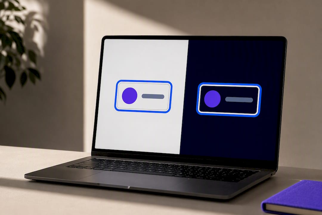
The single most robust pattern for focus state optimization is the two-color indicator, and it solves a problem that a lot of single-color approaches never account for: you don’t control what’s behind your focus ring. A button might sit on a white card in one part of the interface and a dark hero banner in another. One outline color can’t win against both.
The C40 technique fixes this by pairing two contrasting colors, often a light and a dark band, so that whichever background the component sits on, at least one band clears the 3:1 threshold. If the two indicator colors contrast against each other by roughly 9:1, you get built-in insurance against nearly any background color underneath.
.focusable:focus-visible {
  outline: 2px solid #ffffff;
  box-shadow: 0 0 0 4px #005fcc;
}
That’s a white inner outline wrapped by a blue box-shadow. Against a dark background, the white band pops. Against a light background, the blue band does the work. You never have to guess which one wins.
:focus-visible deserves its own note. It lets you show a strong indicator specifically for keyboard and switch users while staying quiet for mouse clicks, which cuts down on visual noise without cutting corners on accessibility. But it relies on browser heuristics to guess input intent, and those heuristics vary. Older browsers don’t support the selector at all, so ship a fallback:
.focusable:focus {
  outline: 2px solid #005fcc;
}

.focusable:focus-visible {
  outline: 2px solid #ffffff;
  box-shadow: 0 0 0 4px #005fcc;
}
Pro Tip: Never rely on box-shadow alone. Forced-color modes (Windows High Contrast, for instance) can strip box-shadow entirely, leaving you with zero visible indicator. Always pair it with an actual outline property, even a transparent one, so the operating system has something concrete to render.
.focusable:focus-visible {
  outline: 2px solid transparent;
  box-shadow: 0 0 0 4px #005fcc;
}
A short list of the mistakes that undo all of this in one line of code:
outline: none;with nothing to replace it, the single most common accessibility regression in production CSS- Relying on color alone to signal focus, which fails for anyone with a color vision difference
- Box-shadow-only indicators with no outline fallback for forced-color modes
- Copy-pasting a design system’s hover style onto focus, ignoring that they’re different input modalities
- Testing only in Chrome and assuming Firefox and Safari will render
:focus-visibleidentically
How to Test Focus State Accessibility Before You Ship
Testing focus usability guidelines properly means combining three layers: manual keyboard checks, contrast measurement, and forced-color validation. Skip any one and you’ll ship something that looks compliant in a design file and fails in a browser.
- Unplug your mouse and tab through the entire page. Every interactive element, links, buttons, form fields, custom dropdowns, needs a visible indicator when it receives focus. Use Shift+Tab to confirm reverse order works too.
- Watch for focus traps. If tabbing into a modal or menu ever leaves you stuck with no way to tab back out, that’s a hard failure regardless of how good the visual indicator looks.
- Check that focus order matches visual order. SC 2.4.3 requires focus to move in a sequence that preserves meaning and operability, generally left to right, top to bottom, matching how the page reads visually.
- Measure the change-of-contrast directly. Take a screenshot of the unfocused state and the focused state, then compare the exact pixels that changed using a contrast checker. Don’t check the indicator against the page background; check it against its own unfocused version.
- Switch on forced-color or high-contrast mode in your OS settings and repeat the keyboard pass. Box-shadow-only styles will often disappear entirely here, which is exactly the failure mode C40’s outline fallback prevents.
- Run an automated scan to catch missing focus styles,
outline: nonedeclarations, and other code-level patterns at scale, then follow it with the manual pass above. Automated checks catch a real subset of focus issues efficiently, but they can’t fully judge visual perceptibility the way a human eye tabbing through a live page can.
Tools worth having in the QA rotation: browser DevTools’ accessibility inspector for checking computed focus styles, a contrast checker for the pixel comparison in step four, and your OS’s built-in high-contrast toggle for step five. None of this requires exotic software. It requires doing the pass every release, not just at launch.
Building an Accessible Focus State Rollout Your Whole Team Can Follow
Focus state enhancements stick when they’re built into the workflow, not bolted on before a compliance deadline. A practical rollout touches four stages.
Design system and tokens. Focus styles belong in your design tokens from the start, defined once as a color pair or outline spec, then inherited by every component. Retrofitting focus styles component-by-component after launch is slower and far more inconsistent than defining them once at the token level.
Developer implementation. Build the two-color or outline-plus-shadow pattern into your base CSS reset, apply :focus-visible with a :focus fallback for older browsers, and test rendering in at least Chrome, Firefox, and Safari before merging.
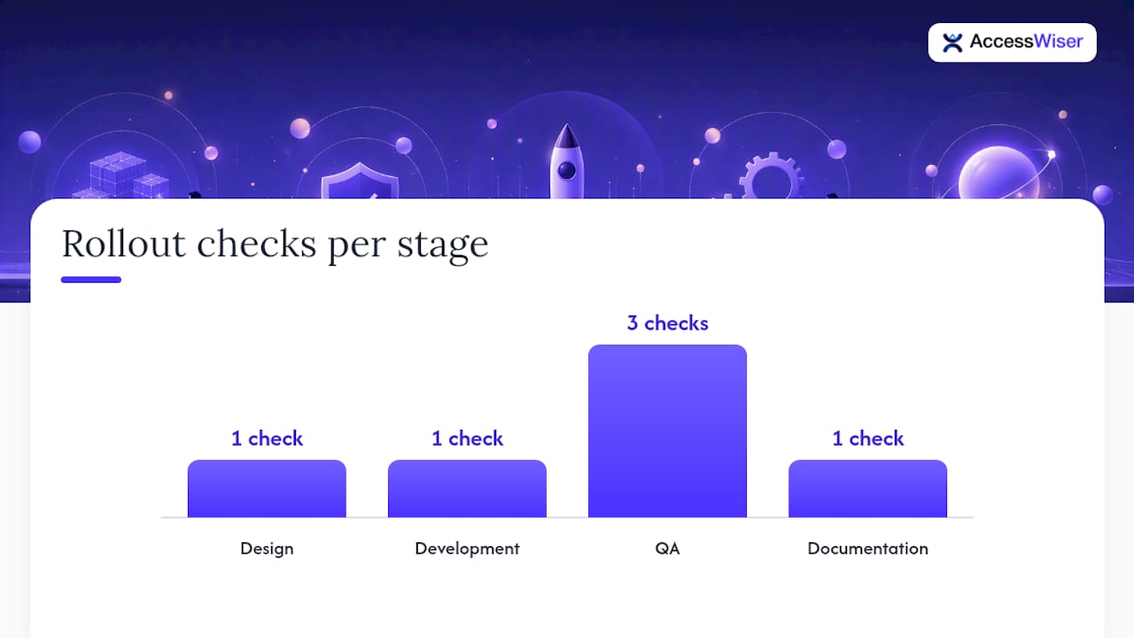
QA gates. Require three checks before release: an automated scan for missing or suppressed focus styles, a full manual keyboard pass across the page, and a forced-color mode check. None of these substitute for the others.
Documentation. Update your accessibility statement with the date of the fix and what changed, keeping a dated record that shows the work actually happened rather than just claiming compliance in general terms.
- Focus tokens defined at the design system level, not per component
- CSS reset includes the two-color or outline-plus-shadow pattern by default
:focus-visibleimplemented with a:focusfallback for legacy browser support- Forced-color mode tested explicitly, not assumed to inherit from box-shadow
- Automated scan run pre-release, manual keyboard pass run pre-release
- Accessibility statement updated with the date of the change
| Rollout stage | Owner | What gets checked |
|---|---|---|
| Design | Design system lead | Focus tokens exist and meet 3:1 change-of-contrast |
| Development | Front-end engineer | Two-color/outline pattern implemented with fallbacks |
| QA | QA engineer | Keyboard pass, forced-color check, automated scan |
| Documentation | Compliance owner | Accessibility statement dated and updated |
How AccessWiser Turns Focus-State Fixes Into Documented Proof
Finding a broken focus indicator is one problem. Proving you fixed it, on the record, with a date attached, is another. AccessWiser scans map directly to WCAG 2.2 AA success criteria, including focus-related checks, with Section 508 and EN 301 549 mappings for teams that need to satisfy multiple regulatory frameworks at once.
Each finding ties to the specific element and criterion it affects, paired with plain-language guidance for fixing it directly in your source code rather than patching it at runtime. That’s what makes the fix permanent instead of temporary.
Scheduled re-checks catch regressions when a future deploy quietly reintroduces outline: none, and every scan, fix, and accessibility statement update gets a dated record, giving your team actual evidence of an ongoing accessibility effort rather than a one-time audit that ages out of relevance.
Design-System-First Beats Retrofitting, Every Time
The teams that struggle most with focus state accessibility aren’t the ones lacking knowledge of SC 2.4.13. They’re the ones treating focus styles as a launch-week cleanup task instead of a design system decision made on day one.
Retrofitting means auditing dozens of components after the fact, often finding five slightly different focus treatments across a codebase because nobody defined one canonical pattern early. A design-system-first approach means the color tokens, offset values, and state diagrams for focus ship inside the component library itself, so every new button inherits the correct behavior automatically. Designer-to-developer handoff should specify the exact indicator colors, the offset in pixels, and how the state changes on focus versus hover versus active, not leave engineers to interpret a Figma comp that never addressed keyboard interaction at all.
Bring in accessibility specialists and real user testing before launch, not after a complaint. By then, the fix is expensive and the damage to trust is already done.
— The AccessWiser Team
Get Focus-State Issues Found, Fixed, and Documented
Fixing focus indicators across dozens of components by hand, then hoping nothing regresses on the next deploy, is a slow way to stay compliant. AccessWiser scans your site against WCAG 2.2 AA, Section 508, and EN 301 549, flags focus-related gaps down to the specific element and criterion, and hands your developers plain-language guidance for fixing the code permanently rather than patching it at runtime. Scheduled re-checks catch it if a future release quietly strips an outline again, and every scan and fix gets a dated record you can point to as evidence of an ongoing effort.
Plans start at $24 a month with the Starter tier, scaling up through Basic, Pro, and Business as your page count and monitoring needs grow. Start a free trial and run your first scan to see exactly where your focus states stand today.
Where to Go Deeper on Focus Appearance
A few sources are worth bookmarking if you’re implementing this beyond a single project:
- Understanding SC 2.4.13: Focus Appearance, the official W3C explanation of the perimeter and contrast thresholds, including edge cases and exceptions
- C40: Creating a two-color focus indicator, the technique behind the dual-band pattern covered above
- C15: Using CSS to change presentation on focus, a simpler CSS-only approach for straightforward components
- :focus-visible on MDN, the browser support tables and syntax reference for keyboard-specific styling
- A practitioner’s guide to accessible focus indicators, for design-spec language and real component examples
Sources
- Understanding Success Criterion 2.4.13: Focus Appearance
- C40: Creating a two-color focus indicator to ensure sufficient contrast
- :focus-visible CSS pseudo-class - MDN
- A guide to designing accessible, WCAG-conformant focus indicators
FAQ
What Does WCAG 2.4.13 Require for Focus Appearance?
SC 2.4.13 requires a keyboard focus indicator to have a visible area at least as large as the area of a 2 CSS-pixel perimeter and a 3:1 change-of-contrast between focused and unfocused pixel states.
What Are the Four Types of Accessibility?
Accessibility guidance generally groups barriers into four categories: visual, auditory, motor, and cognitive. Focus indicators specifically address motor accessibility (for keyboard and switch users) and visual accessibility (for people with low vision who need strong contrast to track focus).
Can Hover and Focus States Use the Same Style?
They can share a style, but they shouldn’t rely on each other, since hover only responds to a mouse and focus responds to keyboard, switch, and voice input. Defining focus separately, ideally through :focus-visible with a two-color pattern like C40, guarantees keyboard users always get an indicator even if the hover style was designed for a completely different input method.
What Is the Focus Order Requirement Under WCAG 2.4.3?
SC 2.4.3 requires that focusable elements receive focus in a sequence that preserves meaning and operability, typically matching the visual reading order of the page. Breaking this order, for example when a modal traps focus incorrectly or a custom widget skips elements, undermines focus management accessibility even if individual indicators look fine.
Does AccessWiser Check for Focus-State Issues?
Yes. AccessWiser scans map to WCAG 2.2 AA, including focus-related success criteria, and flag missing or insufficient focus indicators down to the specific element involved. Current pricing, including the $24 per month Starter plan, is listed on the AccessWiser pricing page.
Articles on this blog are general information about web accessibility, not legal advice. Laws change and their application depends on your specific situation — for decisions with legal consequences, consult a qualified legal professional.
Articles on this blog are general information about web accessibility, not legal advice. Laws change and their application depends on your specific situation — for decisions with legal consequences, consult a qualified legal professional.