Blog · 14 min read
6 Inclusive Website Design Principles Mapped to WCAG 2.2 for Dev Teams

Inclusive website design means building digital experiences that people with a wide range of abilities, devices, and contexts can actually use. The single most important next step is to get semantic HTML right and cover the core WCAG 2.2 AA success criteria before layering on anything else. That order matters more than any tool you pick.
TL;DR:
- Prioritize semantic HTML and core WCAG 2.2 AA success criteria to ensure accessibility rather than relying solely on tools.
- Implement flexible controls, predictable layouts, and high-contrast, readable text to accommodate diverse user needs and device constraints.
- Conduct early and ongoing user research with people with disabilities to identify and address practical barriers in real-world scenarios.
- Incorporate manual testing and user feedback into your workflow because automated scanners only detect a portion of accessibility issues.
- Maintain continuous monitoring, documentation, and team training to sustain accessible features and demonstrate ongoing regulatory compliance.
Table of Contents
- What Is Inclusive Website Design, Really?
- Core Inclusive-Design Principles and Patterns to Apply Today
- Which WCAG 2.2 Criteria Actually Drive Frontend Work?
- Why User Research Changes What You Build
- Inclusive Patterns Worth Copying Directly
- Building a Testing Stack That Actually Catches Problems
- How Long and How Much Does This Actually Cost?
- Considerations for Mobile and Responsive Inclusive Design
- Writing and Structuring Content for Every Reader
- Keeping Inclusive Design Alive After Launch
- Why We Treat Inclusive Design as a Quality Metric, Not a Checklist
- Turning Inclusive Design Principles Into Documented Progress
- Sources
- FAQ
What Is Inclusive Website Design, Really?
People use “inclusive design,” “accessibility,” and “universal design” as if they’re interchangeable. They’re not, and the difference changes how you make decisions.
Accessibility is the outcome: a site works for people with disabilities, measured against a standard like WCAG. Universal design aims for one solution that works for everyone, no exceptions or variations. Inclusive design takes a different stance. It recognizes exclusion first, asks who gets left out by a given decision, and then builds flexibility to bring them back in, even if that means offering more than one path to the same result.
That distinction shows up constantly in practice:
- A universal-design mindset might force one font size for everybody.
- An inclusive-design mindset lets users adjust text size, contrast, and spacing to their own needs.
- Accessibility work checks whether that adjustable interface actually meets WCAG 2.2 success criteria.
Inclusive design is the philosophy. Accessibility is the measurable target. Semantic HTML and WCAG-mapped patterns are how you get there. Once you separate these, “make it accessible” stops being vague and becomes a concrete build spec.
Core Inclusive-Design Principles and Patterns to Apply Today
Six principles turn “inclusive” from a values statement into a working method.
- Flexibility. Let users control presentation: font size, contrast, motion. Pattern: build a settings panel or honor the browser’s
prefers-reduced-motionand zoom settings rather than fighting them. - Simplicity. Fewer steps and clearer language reduce cognitive load for everyone, not just users with cognitive disabilities. Pattern: cap forms at one primary action per screen.
- Predictability. Navigation, button behavior, and layout should stay consistent across pages. Pattern: never change the location of a “submit” button based on context.
- Legibility. High contrast and adjustable text size help older users and people with low vision, among others, according to Nielsen Norman Group research. Pattern: minimum 4.5:1 contrast ratio for body text.
- Choice. Offer more than one way to complete a task. Pattern: support both keyboard shortcuts and pointer input for the same action.
- Robustness. Code should degrade gracefully across assistive technologies and browsers. Pattern: test with a screen reader before shipping any custom component.
Pro Tip: Build at least one persona with a disability into every project brief, not as an afterthought slide but as a named user with specific needs, like a screen reader user checking out on mobile with one hand. Design decisions get sharper when you’re solving for a real constraint instead of an abstract “everyone.”
Which WCAG 2.2 Criteria Actually Drive Frontend Work?
WCAG 2.2 groups its success criteria under four principles known as POUR: Perceivable, Operable, Understandable, and Robust. Most of your day-to-day frontend decisions map to a handful of these criteria, and knowing which ones matters more than memorizing the full list.
- Alt text (1.1.1, Perceivable). Every meaningful image needs a text alternative; decorative images get an empty
alt="". - Keyboard access (2.1.1, Operable). Every interactive element, menus and modals included, must work without a mouse.
- Focus visibility (2.4.7 and the newer 2.4.11 Focus Not Obscured, both Operable). Users need to see where keyboard focus is, and sticky headers or overlays cannot hide it.
- Contrast (1.4.3, Perceivable). Text needs a 4.5:1 ratio against its background at standard sizes.
- Forms and errors (3.3.1, 3.3.2, Understandable). Labels stay attached to inputs, and error messages describe exactly what to fix.
- Reflow (1.4.10, Perceivable). Content restructures cleanly at 320px wide without horizontal scrolling.
- Target size (2.5.8, new in WCAG 2.2, Operable). Touch targets need at least 24 by 24 pixels of space, with some exceptions.
- Dragging alternatives (2.5.7, new in WCAG 2.2, Operable). Any drag-based interaction needs a single-pointer alternative, like tap-to-select instead of drag-to-reorder.
On the semantic HTML question: use the native element first. A <button> gives you keyboard support, focus behavior, and screen reader semantics automatically. Reaching for a <div> with an ARIA role rebuilds all of that by hand, and it’s easy to get wrong. Frontend developers who work on accessibility daily consistently point to semantic markup as the more durable fix, with ARIA reserved for genuine gaps native HTML can’t cover.
Automated scanners catch contrast failures, missing alt text, and malformed forms reliably. They cannot tell you whether your error message actually makes sense to a screen reader user, or whether your custom dropdown traps keyboard focus. That’s why manual keyboard testing and real screen reader checks still have to happen before launch.
Why User Research Changes What You Build
Involving people with disabilities early in the process, not just at a final audit, catches problems that no checklist will surface on its own. W3C’s Web Accessibility Initiative frames this as core to the process: some fixes are simple, but others need input from someone who actually uses a screen reader, switch device, or screen magnifier every day.
You don’t need a formal lab to do this well.
- Run remote, moderated sessions with three to five participants who use assistive technology regularly.
- Give them realistic tasks, like completing checkout or finding a support contact, instead of asking abstract “does this look accessible” questions.
- Record the assistive technology output itself, not just the participant’s verbal reaction, so developers can hear exactly what a screen reader announced.
- Fold findings directly into personas and acceptance criteria: a session where a participant couldn’t find the focus indicator becomes a written test case, not a footnote.
That last step is where most teams drop the ball. Research that never becomes a ticket or a test case gets forgotten by the next sprint.
Inclusive Patterns Worth Copying Directly
Four patterns show up across well-built sites because they solve real, common exclusions.
- Captions and transcripts on every video make content usable without sound and support WCAG’s Perceivable criteria (1.2.2, 1.2.1). Checklist: caption files synced within one second, transcript published alongside the embed.
- Adaptable layouts that reflow cleanly at any zoom level or screen width satisfy the Reflow criterion (1.4.10). Checklist: test at 400% zoom before calling a page done.
- Accessible forms with specific error messages (“Enter a phone number with 10 digits” instead of “Invalid input”) map to WCAG 3.3.1 and 3.3.3. Checklist: every error links back to its field programmatically.
- Inclusive imagery and plain-language copy avoid idioms and jargon that trip up non-native speakers and screen reader users alike. Checklist: run copy through a readability check before publishing, an approach covered well in these readability guidelines.
Each pattern is small on its own. Together, they cover a lot of the exclusion territory a typical site creates without meaning to.
Building a Testing Stack That Actually Catches Problems
No single testing method finds everything, and treating any one of them as sufficient is how bugs slip into production.
Automated scanners are the right starting point because they’re fast and run in continuous integration on every code change. But automated tools typically detect only 30 to 40 percent of real accessibility issues. The rest requires manual keyboard testing (tab through every page, confirm nothing traps focus) and screen reader checks with tools like VoiceOver or NVDA. User testing with people who have disabilities closes the remaining gap, catching the issues that neither a scanner nor an internal QA pass will notice.
A significant portion of computer users find that accessible design patterns, like text alternatives and better keyboard navigation, make websites significantly easier to use, Section508. That number includes people with no diagnosed disability at all: users on slow connections, older adults, and anyone working from a phone in bright sunlight.
This is where a structured platform earns its keep. AccessWiser’s scanning and remediation solutions run automated checks against WCAG 2.2 AA, then pair every finding with plain-language guidance tied to the exact element and code causing the problem. Scheduled re-checks catch regressions after a redesign or a rushed feature launch, which is usually where accessibility work quietly breaks.
- Run automated scans on every deploy, not just before launch.
- Schedule manual keyboard and screen reader passes quarterly at minimum.
- Recruit user testing sessions before major redesigns, not after.
How Long and How Much Does This Actually Cost?
Timelines vary by codebase, not ambition. A small marketing site can reach solid WCAG 2.2 AA coverage in a few weeks. A template or CMS-driven site, where fixes propagate across many pages at once, typically takes one to three months. A legacy enterprise platform with custom components built over years can take several months of steady work.
Prioritize by impact and effort, not alphabetical order:
- Fix shared templates and components first since one fix cascades everywhere.
- Tackle checkout, signup, and other high-conversion forms next; these carry the highest legal and revenue risk.
- Address high-traffic pages before low-traffic ones.
Cost drivers break down into internal developer hours, any third-party remediation help, and ongoing tooling subscriptions. A quick triage pass on templates and checkout flows reduces both legal risk and lost conversions faster than a slow, comprehensive audit that delays fixes for months.
Considerations for Mobile and Responsive Inclusive Design
Mobile accessibility problems compound because the constraints stack: smaller screens, touch-only input, variable connection speeds, and one-handed use. Inclusive design on mobile has to account for all of that simultaneously.
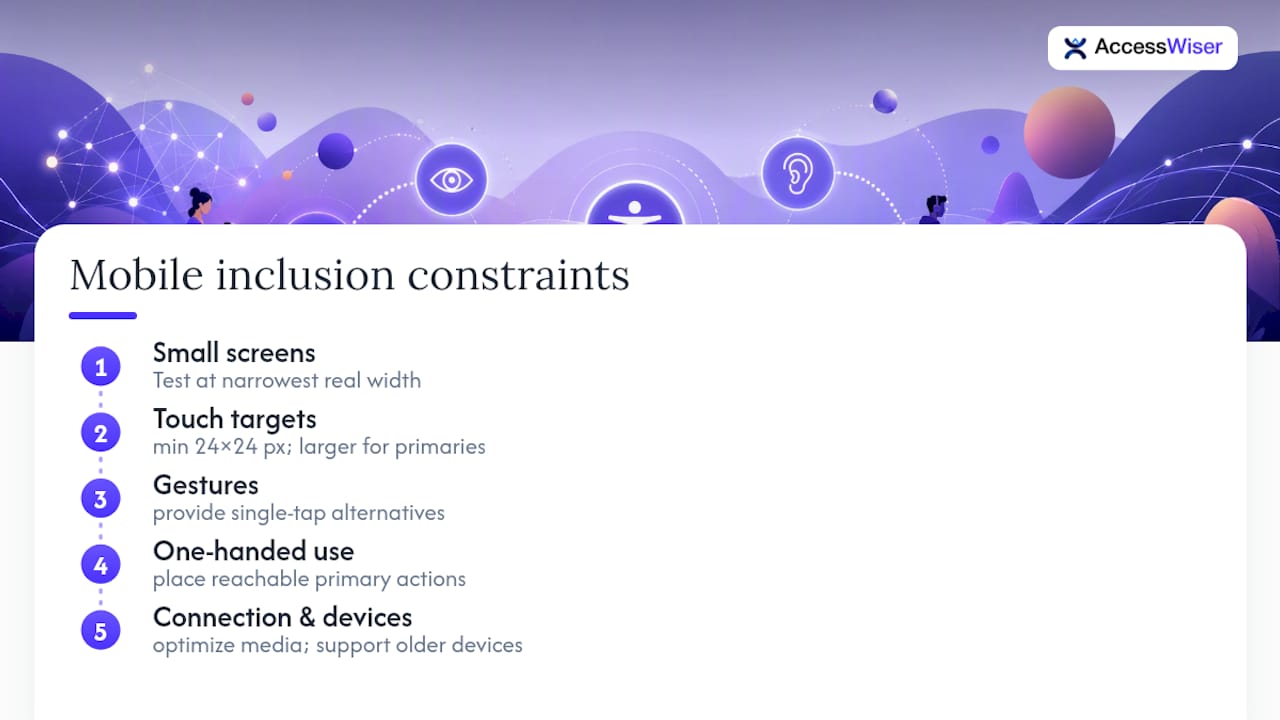
Touch target size is the most common failure point. WCAG 2.2’s new 2.5.8 criterion sets a minimum of 24 by 24 pixels for interactive elements, and in practice you want more breathing room than that minimum, especially for primary actions like “add to cart” or “submit.” Cramped navigation bars and icon-only buttons without labels are frequent offenders.
Responsive reflow deserves its own attention beyond desktop testing. A layout that passes contrast and structure checks at 1200 pixels wide can break completely at 320 pixels, hiding content behind horizontal scroll or collapsing navigation into an unusable state. Test at the narrowest realistic width your analytics show real traffic from, not just a convenient breakpoint.
Gesture-based interactions need alternatives. Swipe-to-delete, pinch-to-zoom, and drag-to-reorder all exclude users with motor impairments or those using a switch device. WCAG 2.2’s dragging alternative criterion exists specifically because designers kept shipping drag-only interactions with no single-tap fallback.
Orientation lock is another quiet exclusion. Forcing portrait-only or landscape-only views blocks users who have their device mounted for support reasons or who simply prefer one orientation. Unless there’s a strong content reason, let the layout adapt to whichever orientation the user has.
Connection speed matters for inclusion too. Heavy images and unoptimized video punish users on limited data plans, which correlates with both economic access and, often, older devices lacking the assistive technology optimizations found on current hardware.
Writing and Structuring Content for Every Reader
Design patterns and code fixes only get you halfway. The words on the page carry their own accessibility weight, and plain language is where a lot of otherwise well-built sites still fail readers.
Plain language means short sentences, common words, and one idea per paragraph. It’s not a dumbing-down exercise: it’s what lets a non-native English speaker, someone with a cognitive disability, and a person skimming on a lunch break all get the same information from the same page. Aim for a reading level a general audience can follow without a second pass, and test actual drafts against a readability tool rather than trusting instinct.
Headings need to describe what follows, not tease it. Screen reader users often navigate by jumping between headings alone, so a heading like “Getting Started” tells them nothing useful compared to “How to Create Your Account.”
Multilingual support matters more than a language toggle in the footer. Machine-translated content that ignores idiom, tone, and cultural context can confuse readers just as badly as no translation at all. If your audience spans languages, budget for human review of at least the highest-traffic pages, and make sure form labels, error messages, and legal text get the same translation attention as marketing copy usually does.
Audio and video content need text equivalents that carry real meaning, not filler captions. A transcript that just says “music playing]” for an instructional video misses the point. Tools that convert written content into audio, [like text-to-speech services, can also extend your content’s reach to users who prefer listening, including people with dyslexia or low vision.
Keeping Inclusive Design Alive After Launch
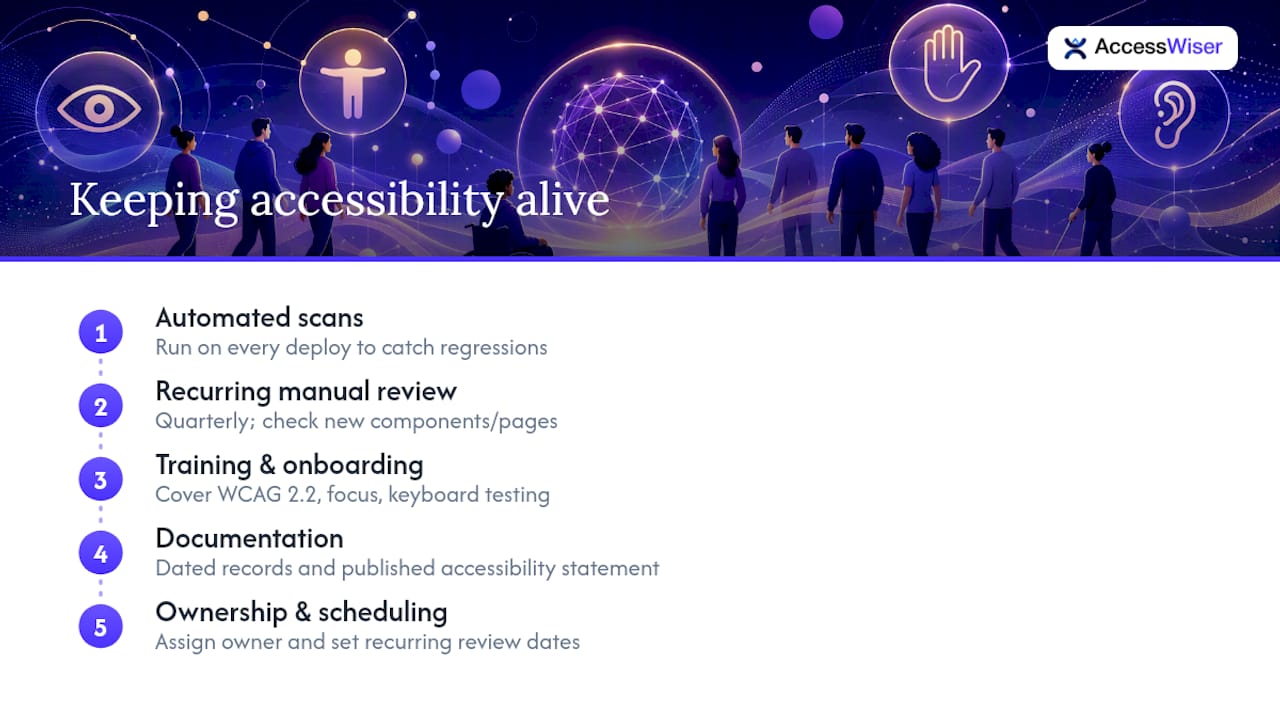
A site that passes an accessibility audit on launch day can fail six months later, and that’s usually not because anyone did anything dramatically wrong. It’s because a new component shipped without a keyboard test, or a marketing team added an image carousel with no alt text under deadline pressure.
Ongoing monitoring has to be scheduled, not reactive. Automated scans running on every deploy catch a meaningful share of regressions immediately, before they reach production. Pair that with a recurring manual review, quarterly is a reasonable cadence for most teams, that specifically checks new components and pages added since the last pass.
Training matters as much as tooling. Developers who understand why semantic HTML matters write fewer accessibility bugs in the first place, compared to teams that treat accessibility as a checklist someone else runs at the end. A short onboarding session covering the core WCAG 2.2 AA criteria, focus management, and how to test with a keyboard alone pays for itself within the first few sprints.
Documentation closes the loop. Keeping dated records of what was scanned, what was fixed, and when an accessibility statement was last updated gives a business real evidence of ongoing effort, which matters both for internal accountability and for anyone reviewing your compliance posture externally. Publishing and maintaining an accessibility statement is a small task that pays off disproportionately when someone asks what your team has actually done, not just what it claims.
Treat accessibility work the same way you treat security patching: assign clear ownership, set a recurring review date, and never let “we’ll get to it” become the permanent status of a known issue.
Why We Treat Inclusive Design as a Quality Metric, Not a Checklist
Most teams treat accessibility as a one-time audit. That’s backwards. Embed keyboard and contrast checks directly into design reviews and pull requests, measure pass rates the same way you track page speed, and train every new hire on the basics before they ship a single component. Quality metrics get maintained. Checklists get forgotten.
— The AccessWiser Team
Turning Inclusive Design Principles Into Documented Progress
Knowing the WCAG 2.2 criteria is one thing. Proving you’ve applied them, to a customer, an auditor, or your own leadership, is another challenge entirely, and it’s where most teams lose momentum after the initial push. AccessWiser scans your site against WCAG 2.2 AA success criteria, with mappings to Section 508 and EN 301 549 for teams that need broader regulatory coverage. Every finding comes with plain-language guidance tied to the specific element and code causing it, so your developers fix the actual markup instead of patching around it at runtime.
Scheduled re-checks catch regressions automatically after every redesign or feature release, and dated records of scans and fixes give you documented evidence of an active accessibility program. An optional widget lets visitors adjust contrast, text size, and motion settings on their own terms. Explore AccessWiser’s accessibility solutions and start your free trial to see where your site stands today.
Sources
- Section508
- Involving users in accessibility evaluation (W3C WAI)
- Inclusive design (Nielsen Norman Group)
FAQ
What Is an Inclusive Website?
An inclusive website is one designed so people with a wide range of abilities, devices, and connection speeds can access and complete tasks on it, typically measured against standards like WCAG 2.2.
How Do You Make a Website Inclusive?
Start with semantic HTML, cover core WCAG 2.2 AA criteria like contrast, keyboard access, and alt text, then confirm the work with manual and user testing rather than relying on automated scans alone.
What’s a Good Example of Inclusive Design?
Adjustable text size and contrast settings are a strong example, since they help users with low vision, older adults, and anyone reading in bright sunlight, as Nielsen Norman Group’s research on inclusive patterns notes.
What Are the Four C’s of Website Design?
There’s no single agreed-upon “four C’s” framework in accessibility standards; definitions vary by source. WCAG 2.2 instead organizes requirements under four principles known as POUR: Perceivable, Operable, Understandable, and Robust.
Can Automated Tools Alone Make a Site Accessible?
No. Automated scanners typically catch 30 to 40 percent of accessibility issues, so manual keyboard testing, screen reader checks, and real user testing are still necessary to close the gap.
Articles on this blog are general information about web accessibility, not legal advice. Laws change and their application depends on your specific situation — for decisions with legal consequences, consult a qualified legal professional.
Articles on this blog are general information about web accessibility, not legal advice. Laws change and their application depends on your specific situation — for decisions with legal consequences, consult a qualified legal professional.