Blog · 12 min read
Fix Tooltip Accessibility: Standards First Code and 5 Tests for Dev Teams

A properly built tooltip uses role="tooltip" connected to its trigger through aria-describedby, appears on both hover and keyboard focus, keeps focus on the trigger element itself, and stays visible long enough for someone to read or interact with it. That last part means satisfying WCAG 2.2’s Success Criterion 1.4.13: the tooltip has to be dismissible, hoverable, and persistent. Miss any one of those four pieces and you have built a tooltip that fails for keyboard users, screen reader users, or both.
TL;DR:
- Using
role="tooltip"requires proper connection with the trigger viaaria-describedby, which must reference only one tooltip ID per element to avoid confusion.- Tooltips should never receive keyboard focus, so they must stay focusable only on their trigger, and should not include interactive elements like links or buttons inside.
- They must appear on focus, dismiss with Escape, and hide when blurred to ensure keyboard users see consistent, accessible information.
- Avoid relying on
titleattributes or auto-hide timers, and never setpointer-events: noneon tooltip containers, as these are frequent sources of accessibility failures.- On mobile, replace hover-dependent tooltips with toggletips that activate on tap, and always test tooltip experience at high zoom levels and with assistive technologies.
Table of Contents
- What ARIA Roles Make Tooltips Accessible?
- How Should Tooltips Behave on Keyboard Focus?
- What Does WCAG 1.4.13 Actually Require?
- Building an Accessible Tooltip Pattern
- How Do You Test Tooltip Accessibility?
- What Tooltip Mistakes Should You Avoid?
- When Should You Skip Tooltips on Mobile?
- How AccessWiser Helps You Catch Tooltip Failures
- Why Tooltips Are a Last Resort, Not a Default
- Turn Tooltip Fixes Into Documented Progress
- Sources
- FAQ
What ARIA Roles Make Tooltips Accessible?
Getting role="tooltip" right depends on understanding what it actually tells assistive technology: this is supplementary text tied to another element, not a standalone interactive component. The role itself does nothing without a relationship attribute connecting it to the trigger.
That relationship comes down to a choice between two attributes, and picking the wrong one breaks the experience in subtle ways. Use aria-describedby when the tooltip adds extra context to an element that already has a clear label. Use aria-labelledby only in the rarer case where the tooltip is the accessible name, such as an icon button with no visible text. Mixing these up either duplicates the announcement or replaces a perfectly good label with a shorter, less useful one.
The WAI-ARIA Authoring Practices are explicit on one more point that trips up a lot of implementations: the tooltip element itself must never receive keyboard focus. Focus stays on the trigger the entire time the tooltip is visible.
That single rule has a big downstream consequence for content:
- No links, buttons, or form fields inside a tooltip. If it needs to hold an interactive element, it isn’t a tooltip anymore.
- Keep the text short. Tooltips are for a sentence or two of context, not documentation.
- Reference exactly one tooltip
idperaria-describedby. Pointing to multiple ids is valid syntax but muddies the announcement.
Pro Tip: If you find yourself wanting to add a link inside a tooltip, switch patterns entirely. A toggletip or a small dialog handles interactive content properly; a tooltip by definition cannot.
How Should Tooltips Behave on Keyboard Focus?
Tooltip keyboard accessibility hinges on parity between input methods. A sighted mouse user and a keyboard-only user need to reach the exact same information through the exact same trigger, and that means the tooltip has to fire on :focus just as reliably as it fires on :hover.
Three behaviors define a compliant interaction model:
- Reveal on focus. Tabbing to the trigger element should show the tooltip immediately, with no separate keypress required to summon it.
- Dismiss on Escape. Pressing Escape hides the tooltip without moving focus away from the trigger. The user stays exactly where they were, just without the extra text on screen.
- Hide on blur. Tabbing past the trigger to the next focusable element should hide the tooltip automatically, and it should not reappear or trap focus anywhere along the way.
Focus order matters here more than it might seem. A tooltip that gets inserted into the DOM in an unexpected place can scramble the tab sequence, sending keyboard users somewhere they didn’t intend to go. Keep the tooltip markup adjacent to its trigger in the DOM, position it visually with CSS, and never use tabindex on the tooltip element itself.
The MDN documentation on the tooltip role reinforces this: because the tooltip never receives focus, all interaction logic lives on the trigger. That is a feature, not a limitation. It keeps the focus order predictable for screen reader users navigating linearly through a page.
Pro Tip: Test Escape dismissal on every tooltip individually. It’s common to wire it up for the first tooltip a team builds and then forget it on the fifth, especially when tooltips get copy-pasted into new components without full review.
What Does WCAG 1.4.13 Actually Require?
Success Criterion 1.4.13 exists because early tooltip patterns routinely vanished the instant a user needed them most. The criterion breaks into three conditions, and each one protects a different group of people.
- Dismissible. The user can close the tooltip without moving pointer or keyboard focus, typically with Escape. This matters most for people using screen magnification, where a tooltip covering content underneath becomes a real obstruction.
- Hoverable. A sighted mouse user can move the pointer from the trigger onto the tooltip content itself without it disappearing. People with low vision or motor impairments often need that extra distance to actually read the text.
- Persistent. The tooltip stays visible until the user dismisses it, moves focus away, or takes some other clear action. It does not vanish on its own after a fixed timer.
The two failure modes that show up constantly in code reviews are auto-hide timers and pointer-events: none on the tooltip container. A timer that kills the tooltip after two seconds fails Persistent for anyone who reads slower than average. Setting pointer-events: none so clicks “pass through” the tooltip fails Hoverable outright, because the pointer can never rest on it. Quick check for both: hover the trigger, then deliberately move the mouse slowly toward the tooltip text. If it disappears before you get there, or vanishes on a fixed clock regardless of where the pointer sits, the implementation fails.
Building an Accessible Tooltip Pattern
A working implementation starts with a wrapper that binds both :hover and :focus-within, so the tooltip stays visible whether someone is pointing or tabbing, and stays visible while the pointer travels from trigger to popup.
<span class="tooltip-wrapper">
  <button aria-describedby="tip-save">Save</button>
  <span role="tooltip" id="tip-save" class="tooltip">
    Saves changes to your account
  </span>
</span>
.tooltip-wrapper {
  position: relative;
  display: inline-block;
}
.tooltip {
  visibility: hidden;
  opacity: 0;
  position: absolute;
  background: #1a1a1a;
  color: #fff;
  padding: 6px 10px;
  border-radius: 4px;
  font-size: 0.875rem;
  transition: opacity 0.15s ease;
}
.tooltip-wrapper:hover .tooltip,
.tooltip-wrapper:focus-within .tooltip {
  visibility: visible;
  opacity: 1;
}
document.querySelectorAll('.tooltip-wrapper').forEach((wrapper) => {
  wrapper.addEventListener('keydown', (event) => {
    if (event.key === 'Escape') {
      wrapper.querySelector('.tooltip').style.visibility = 'hidden';
      wrapper.querySelector('.tooltip').style.opacity = '0';
    }
  });
});
Notice what is missing: no setTimeout anywhere, no pointer-events: none, and no focus trap. The APG pattern guidance confirms this wrapper approach as the standard fix for the “pointer moves off trigger before reaching the tooltip” problem that plagues naive implementations.
| Implementation piece | Purpose | Common mistake it prevents |
|---|---|---|
:focus-within on wrapper |
Keeps tooltip visible during keyboard navigation | Tooltip disappearing the instant focus shifts internally |
aria-describedby on trigger |
Links tooltip text to the accessible description | Screen readers never announcing the tooltip at all |
| Escape keydown handler | Satisfies the Dismissible requirement | Users stuck with a tooltip blocking content below |
No pointer-events: none |
Satisfies the Hoverable requirement | Pointer clicks passing through, tooltip vanishing mid-hover |
If JavaScript fails to load, the CSS-only hover and focus-within states still work for sighted users on both mouse and keyboard. That is progressive enhancement doing real work: the Escape handler is a nice-to-have layered on top of a baseline that already functions without it.
How Do You Test Tooltip Accessibility?
A tooltip that looks right visually can still fail every screen reader and keyboard test. Running through a fixed sequence catches the gaps that a quick glance at the rendered page never will.
- Tab to the trigger. Confirm the tooltip appears the moment focus lands, with no extra keypress needed.
- Press Escape. Confirm the tooltip closes and focus stays put on the trigger, not somewhere else on the page.
- Tab away. Confirm the tooltip hides cleanly and doesn’t reappear or linger in the accessibility tree.
- Test with a screen reader. Run the same sequence in NVDA, VoiceOver, or Narrator and confirm the description gets announced once, not twice, and not replacing the element’s actual label.
- Zoom to 200%. Move the pointer slowly from trigger to tooltip at that magnification level, since gaps that pass at 100% often fail once everything is scaled up.
A few extra checks round this out:
- Verify the tooltip text scales properly and doesn’t get clipped or overlap other content at higher zoom levels.
- On touch devices, confirm there is a non-hover alternative, since there is no pointer to hover with.
- Check that the tooltip never covers the trigger element itself or other focusable content nearby.
The USWDS accessibility test suite frames this well: test the tooltip in the context of the full page, not in isolation, because layout shifts and z-index conflicts often surface only once real content surrounds the component. Testing at 200% magnification in particular catches hoverability failures that pass every automated scan but fall apart the moment a real user with low vision tries to use the feature.
What Tooltip Mistakes Should You Avoid?
Most tooltip accessibility failures trace back to a small handful of repeated mistakes, and nearly all of them are avoidable with a five-minute code review.
- Relying on the
titleattribute as the only source of tooltip content. It isn’t reliably exposed to keyboard users and can’t be styled or positioned. - Putting interactive elements, like a link or a close button, inside the tooltip itself, when a toggletip or dialog is the correct pattern for that content.
- Setting
pointer-events: noneon the tooltip container, which blocks the pointer from ever resting on it. - Using an auto-hide timer that closes the tooltip regardless of whether the user has finished reading it.
- Rendering the tooltip somewhere detached from the trigger in the DOM, which creates a visual or hover gap between the two.
When Should You Skip Tooltips on Mobile?
Hover doesn’t exist on a touchscreen, which means any tooltip depending purely on :hover is simply unreachable for touch users. The fix isn’t to force a hover simulation. It’s to switch patterns.
A toggletip solves this cleanly: tap the trigger, the extra content appears, tap again (or tap elsewhere) and it closes. Wire it with aria-expanded on the trigger and aria-controls pointing to the content region, so assistive technology tracks the open and closed state correctly. If the revealed content updates dynamically, for example a live validation message, pair it with role="status" so screen readers announce the change without needing to re-navigate to it.
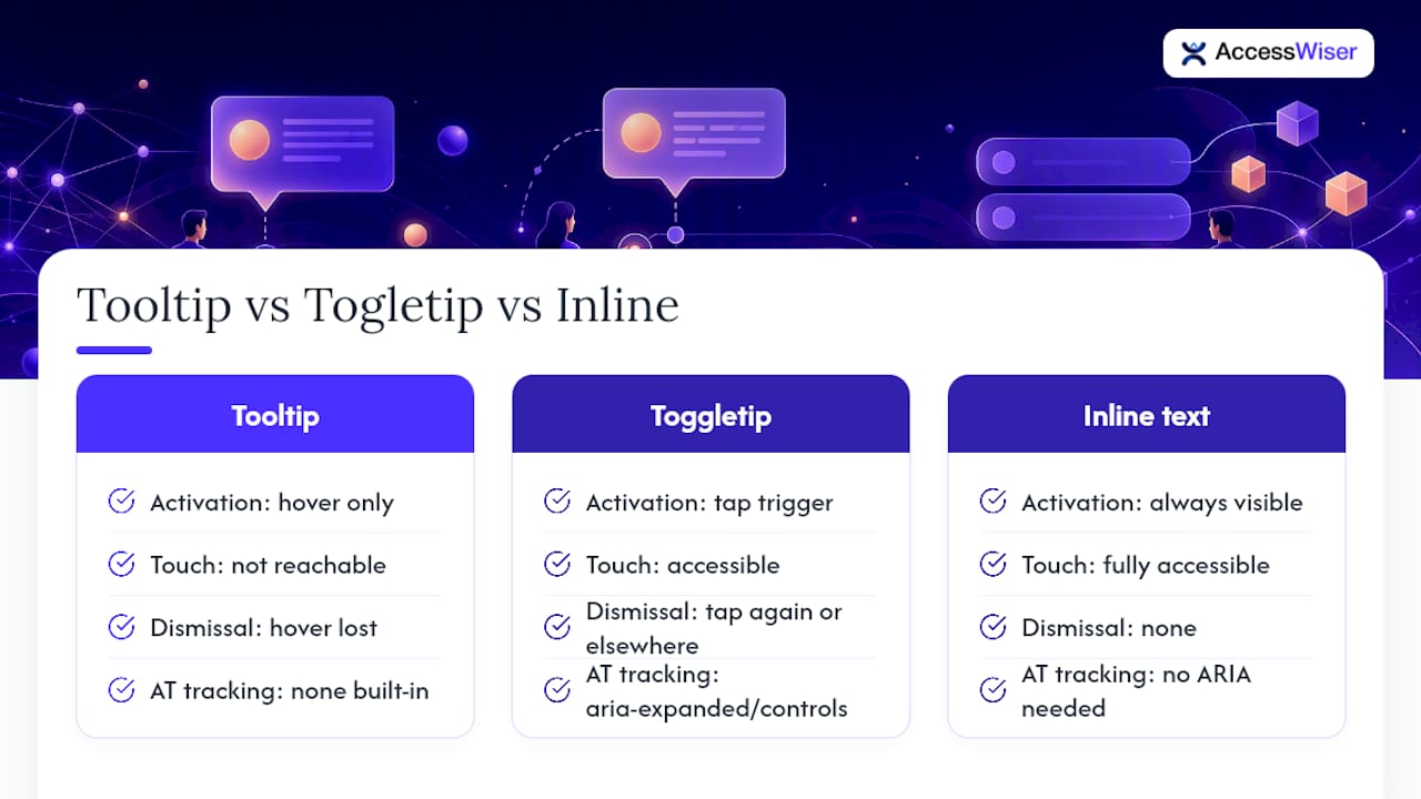
The design trade-off is real: toggletips take an extra tap, and inline visible text takes permanent space. For anything essential to completing a task, visible text wins every time. Save tooltips and toggletips for genuinely supplementary information.
How AccessWiser Helps You Catch Tooltip Failures
Manual review catches a lot, but it doesn’t scale across a hundred-page site with tooltips scattered through every form and dashboard. AccessWiser scans against WCAG 2.2 AA, with mappings to Section 508 and EN 301 549, and ties each finding to the specific element and criterion it violates.
- Findings come with plain-language fixes for the site’s own code, not a runtime patch layered on top.
- Scheduled re-checks catch regressions when a new tooltip component ships without the same review the original got.
- Automated scans handle a real subset of issues, like missing
aria-describedbyor atitle-only implementation, but manual checks with a screen reader and at 200% zoom remain necessary for hoverability and timing.
Why Tooltips Are a Last Resort, Not a Default
Tooltips work best as a small assist, not a container for anything essential. If a label needs a tooltip to make sense, that’s usually a sign the interface needs a clearer visible label instead. We’d rather see teams spend their design budget on plain text than on a perfectly compliant tooltip hiding information someone shouldn’t have to hunt for.
— The AccessWiser Team
Turn Tooltip Fixes Into Documented Progress
Building one compliant tooltip pattern is a good start. Finding every inconsistent tooltip, missing aria-describedby, or leftover title attribute across a site with hundreds of components is a different problem entirely, and it’s the one AccessWiser’s scanning and remediation platform is built to solve. Scans map each finding to WCAG 2.2 AA, Section 508, and EN 301 549, and pair the fix with plain-language guidance your developers can act on directly in the codebase.
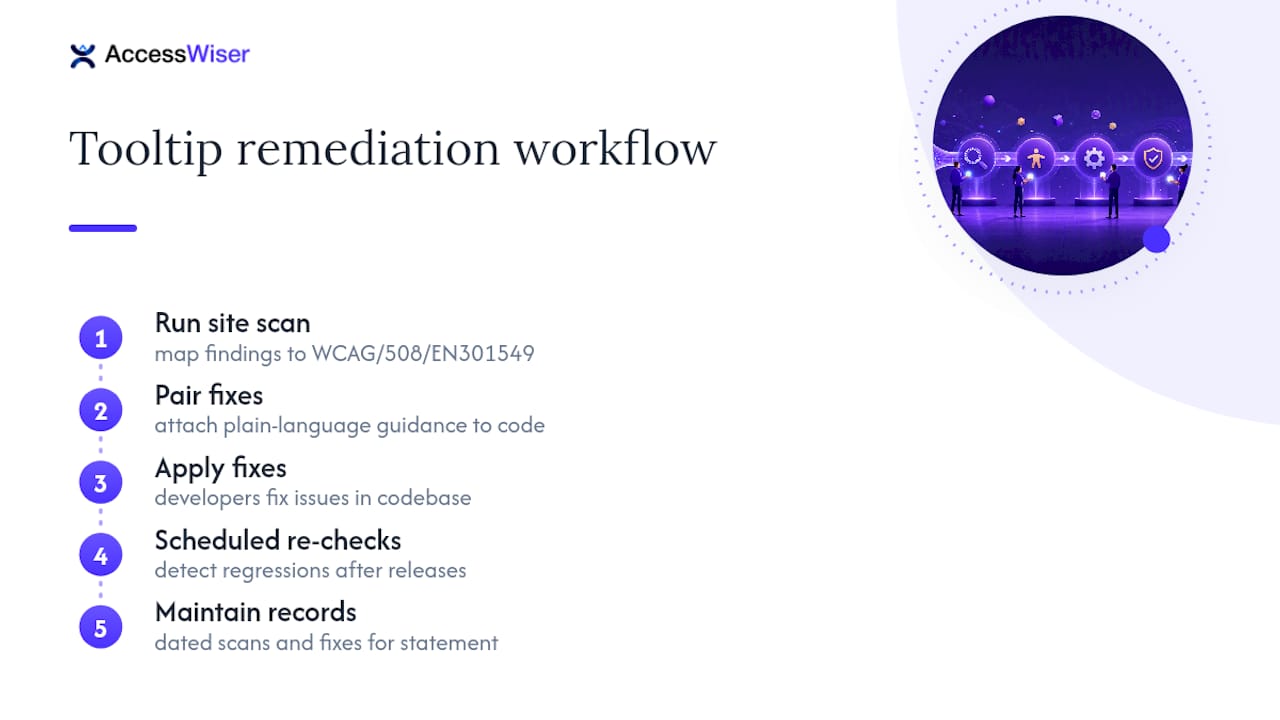
Scheduled re-checks catch it if a new release reintroduces an old problem, and dated records of scans and fixes give you something concrete to show for an accessibility statement, the same kind of public commitment you’ll see published by teams like Opulent Private Care Services. Start a trial on AccessWiser and run your first scan against your own tooltip components today.
Sources
- Understanding 1.4.13: Content on hover or focus | WAI | W3C
- Tooltip accessibility tests | U.S. Web Design System (USWDS)
FAQ
What Is the Purpose of a Tooltip?
A tooltip provides brief, supplementary text tied to a specific element, usually explaining an icon or adding context a visible label doesn’t cover. It should never carry information essential to completing a task, since it’s easy to miss entirely on touch devices.
How Do You Make a Tooltip Show on Keyboard Focus?
Bind the visibility state to :focus-within on a wrapper element (or a focus event handler in JavaScript) alongside :hover, so tabbing to the trigger reveals the tooltip the same way hovering does. This is the core requirement behind tooltip keyboard accessibility and is what makes the pattern usable without a mouse.
What Is the Difference Between a Tooltip and a Pop-Up?
A tooltip is non-interactive, supplementary text that never receives focus and disappears when the trigger loses focus or hover. A pop-up, dialog, or toggletip can contain interactive elements like buttons or links and manages its own focus, which is exactly what a tooltip is not built to do.
How Do You Show a Tooltip on a Disabled Button?
Disabled buttons typically can’t receive focus or fire hover events reliably across browsers, so the common workaround is to wrap the disabled button in a focusable, non-disabled <span> or <div> that carries the tooltip trigger logic instead. Test this pattern carefully with a screen reader, since disabled-element handling varies across browsers and assistive technology.
Articles on this blog are general information about web accessibility, not legal advice. Laws change and their application depends on your specific situation — for decisions with legal consequences, consult a qualified legal professional.
Articles on this blog are general information about web accessibility, not legal advice. Laws change and their application depends on your specific situation — for decisions with legal consequences, consult a qualified legal professional.